
Favorite Google Font Pairings
Don’t get overwhelmed at the tons of fonts to choose from without checking out my 6 favorite Google font pairings first!
Have you ever looked at Google Fonts? There are SO many fonts to choose from and they’re free! Yep, you read that right! Even though it’s great that there are so many different fonts and font styles to choose from, it can be a little bit overwhelming to sift through them all to come up with the best font pairings. So to help you nail that design, I’ve compiled 6 of my favorite Google font pairings to share with you!
Favorite Google Font Pairings
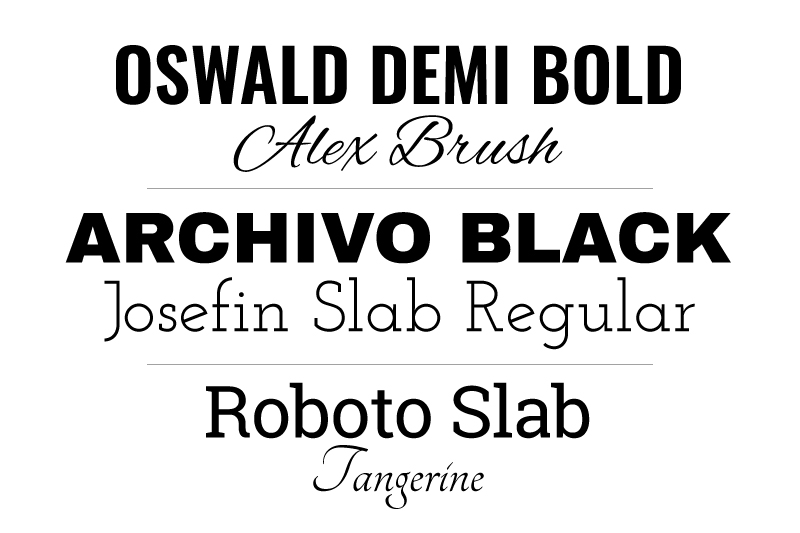
Oswald and Alex Brush
I must admit that I’ve actually used a very similar font pairing for my other blog Domestically Creative. The script is a bit different but still very similar. Both Oswald and Alex Brush give off a very casual vibe in my opinion, so they work great over there. However, Oswald could also be used in a more formal setting as there are several different font styles within the family. I prefer using Oswald Demi Bold in all capitals to get a great visual impact!
Archivo Black and Josefin Slab
This is another play on bold and light fonts. Archivo Black makes great titles and headlines because the thick dark letters really grab your attention. Josefin Slab is an easy to read serif font that would even work as a body of text.
Roboto Slab and Tangerine
This one is a little bit different. I think of this font pairing as working great for Facebook or Pinterest graphic. Roboto Slab comes with different font styles within the family and is even more popular as it’s Sans Serif counterpart. Tangerine is a fun script that is casual yet still somewhat formal with the extra weight to the downstrokes and ends as well as the more traditional letterforms (like that “g”!).
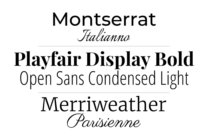
Montserrat and Italianno
Montserrat is another one of my absolute favorite fonts. Sure it may seem pretty straight forward to most people, but it’s so versatile! I use it in a bold format in all capitals for my graphics here, but there are plenty of options when it comes to line/visual weight. Plus, I love that it’s fairly condensed without seeming “squished” like some other condensed fonts I’ve come across. You can really pair Montserrat with any wispy script, but I chose Italianno for this font pairing.
Playfair Display and Open Sans Condensed
This is one of those google font pairings that you will probably see a lot of around the web. Playfair Display and Open Sans are extremely versatile, and you can change around the line weights of each to mix things up too.
Merriweather and Parisienne
Merriweather is one of those Serif fonts that looks so playful to me. I can’t exactly put my finger on it but it strikes me as a little bit more whimsy than a lot of Serif fonts (that aren’t handwritten) I’ve come across. I chose a playful script, Parisienne, to go with it.
What are some of your favorite Google font pairings?
Looking for more help with fonts? Check out these posts too!
- Simple Guide to Pairing Fonts
- How to Install New Fonts
- Introduction to Common Font Styles
- How to Preview Installed Fonts All At Once
Don’t forget to pin it!
One Comment