
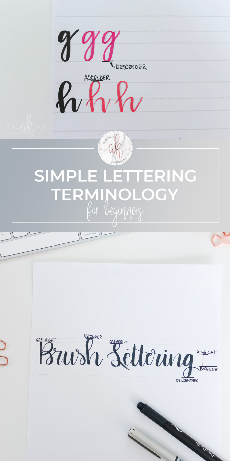
Basics of Brush Lettering | Simple Lettering Terminology
If you are just starting to learn brush lettering or hand lettering of any kind, you may have run across some lettering terminology you aren’t familiar with. Here’s a simple guide to what those terms and descriptions mean.
Today is part 2 in a 4 part series on the basics of brush lettering. If you missed it, make sure you check out part one, an introduction to brush lettering.
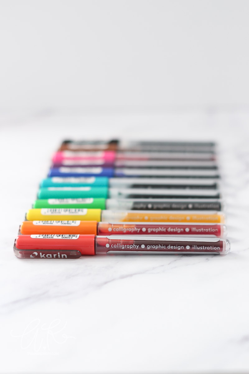
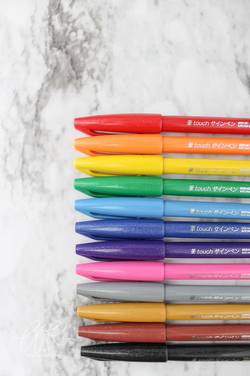
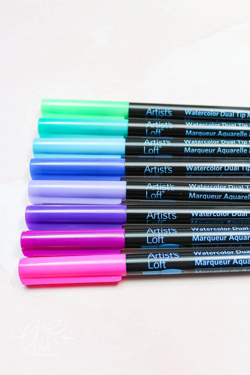
Read Next: Basics of Brush Lettering| Brush Lettering Supplies
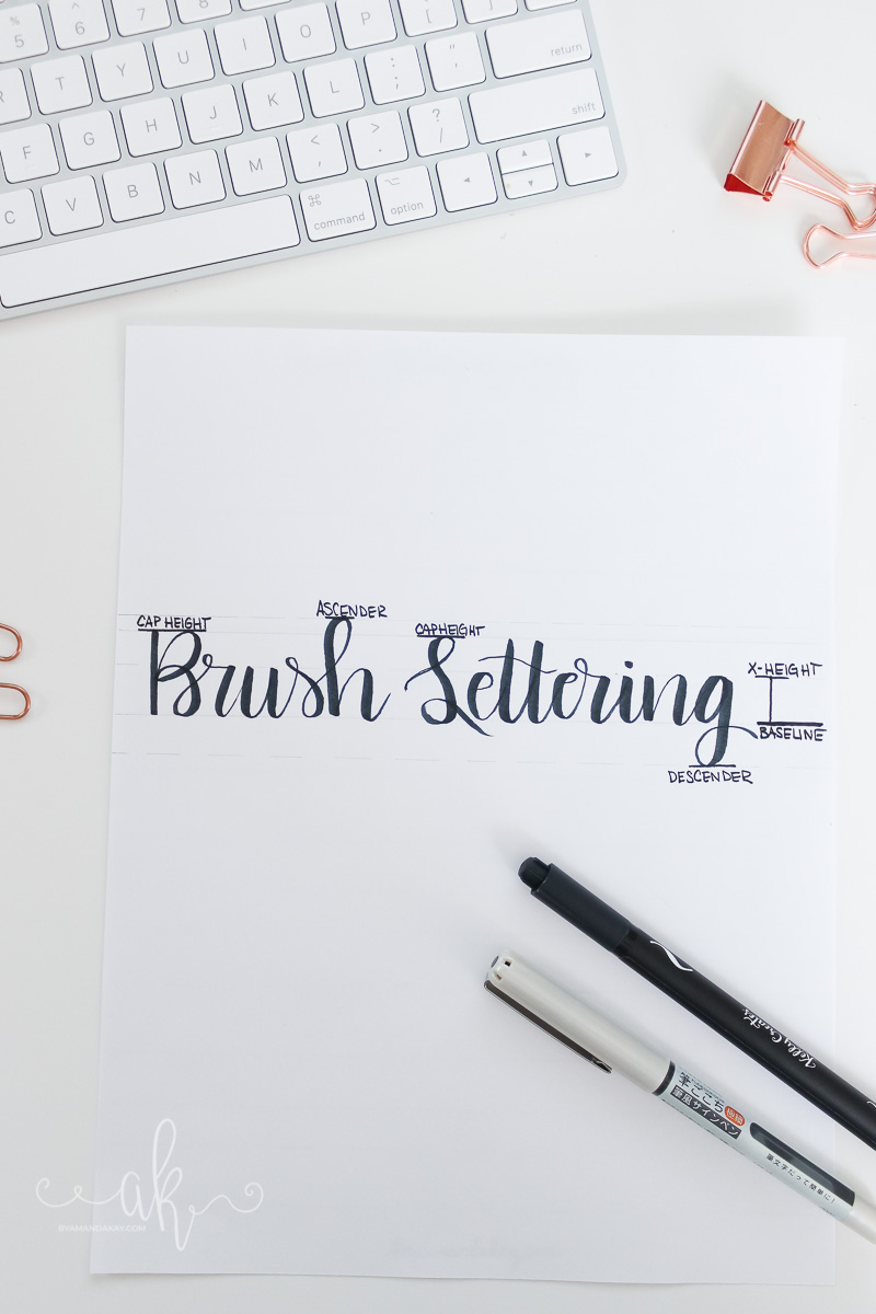
So if you’ve been lettering, or reading about lettering you may have run into some common lettering terminology in your research. Things like ascender and descender may sound confusing if you don’t have a clue what they are, but in reality, they are very straightforward terms. I’ve compiled a list of the more common lettering terminology that has to do with the elements and composition of letters themselves to share with you.
Simple Lettering Terminology
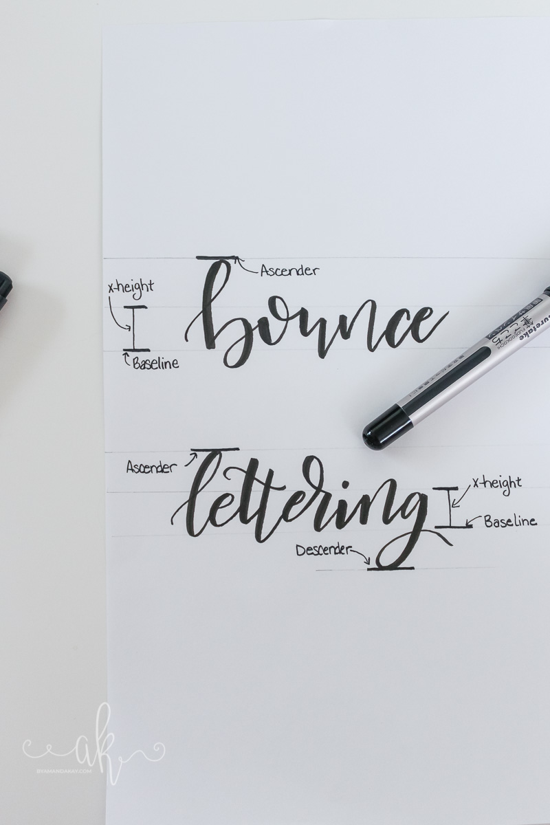
Baseline
This is the line in which the base of each letter rests, whether its an uppercase or lowercase letter.
Ascender
This is where the tops of letters that extend past the x-height line meet. Think letters “b” and “h” as examples. The “stalk” will hit the ascender line.
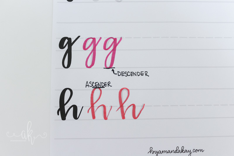
Descender
This is the bottom-most part of a lowercase letter that extends below the baseline. Think of the letter “g” or “y”.
X-Height
This is the distance between the baseline and where the top of the main body of lowercase letters hit. Think of it as a lowercase “x” sitting on the baseline and the distance from the bottom to the top of the letter would be your x-height
Cap Height
This is the distance between the baseline and where the top of an Uppercase letter hits. A lot of times it will be the same height as the Ascender line
Following these guides when you are lettering creates a nice uniform piece and is the best way to practice when you are first starting out. You can print my brush lettering practice sheets to help you get started and there are even a few extra pages at the end to use for practice!
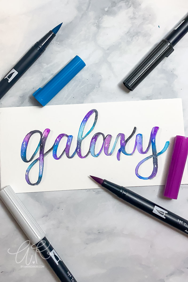
Bounce lettering also applies the same principles and follows the same line guides, but adds a little character to each letter. When you write with “bounce” the letters take on your own unique look and you can create some really fun pieces! In the photo below I wrote out bounce lettering in a basic bouncy style, but as you can see the letters still follow the same line boundaries overall creating a unique but visually appealing layout.
Bounce lettering is still something I’m working at, but if you are looking for recommendations on a great bounce lettering course to take, then I highly recommend Bounce Letters by Teela from Every Tuesday! The class is on Skillshare, and when you join through my referral link you get 2 months free! Plenty of time to take the course and a few other lettering courses too. I really love Teela’s teaching style and even took her iPad lettering and Lettering Layouts courses as well!
Next week we will take a deep dive into my favorite supplies for brush lettering so make sure you check back!
Don’t forget to pin it!
6 Comments